This post looks a little different than most of my previous ones. As my posts start catching up with my finished pages, more of them will likely take this form.
I was actually all set to post the final page, but I decided to make some last-minute changes I haven’t had time to implement yet (so many things to do, aaaaaahhhhhhh!!!!).
In the meantime, I thought it might be fun to zoom in a little and share a portion of the process—from the rough start to something more refined—so you can see all the bad decisions I make along the way and then destroy in the name of giving you that sweet, polished finish I know you all crave.
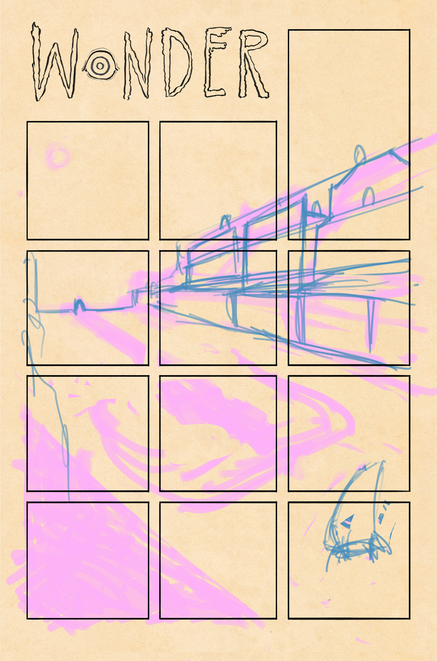
I started with the image above, trying to capture the looming approach of an adversary in a Western town. While I liked the general structure, I felt it lacked movement and tension, so I decided to take another approach to the same idea.
This page wasn’t originally going to exist. In the story I had in my head, the clone emerges, demands the wizard’s hat, and then… well, I don’t want to spoil it, but it was going to head in a different direction. However, I felt the narrative needed another beat—something to build the tension—and I’ve always wanted to draw the kind of suspense you feel just before a shootout. This seemed like the perfect place to do just that.
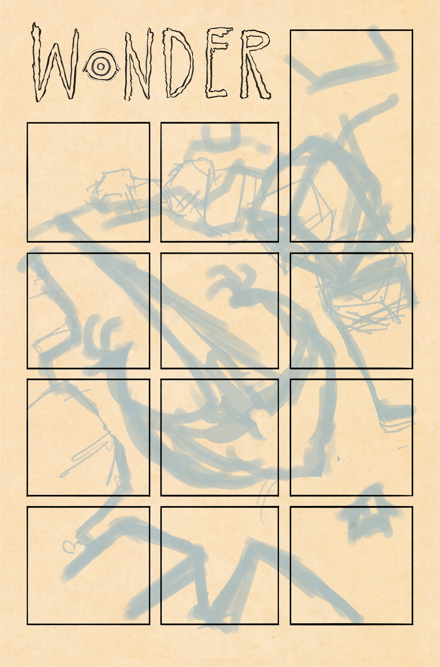
This is how most of my imagined drawings start. I think in big shapes, focusing on the overall composition rather than the smaller details that make it up. The big picture is the most important part—it’s what everything else sits on.
As I’m sure you have noticed these pages are very dense i pack in a lot of little detail, but I rely on a strong overall shape to keep them from feeling too busy—or at least, that’s my intention. As someone who didn’t make this, it might be harder to see what I’m aiming for, but to me, these sketches are like a doctor’s notes: illegible to some, but they give me what I need to move forward.
The addition of clarifying lines is where much of the vision starts to take shape. This phase involves a lot of erasing, redoing, and puzzling things out. In this particular case, though, I ended up scrapping this direction and went with something closer to a mix of my first idea and this one.
That said, looking back at it now, I do like the concept of the town being blown apart by the arrival of a menacing figure. Maybe it’s something to revisit down the line.
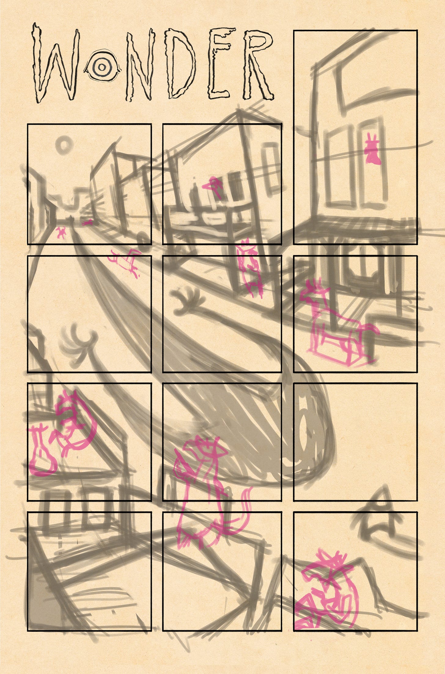
Giving a little curve to this scene and more looming buildings helped to give tention and fluidity to the composition in a way I though the fisrt atemp lacked. I was originally going to have the street free of bystanders reasoning that they had all run in to tacke cover but the idea that the town was inhabited soly of horses made it funnier and more alive.
The image above is an example how I absorb visual information. I don’t have a clear mental picture of what western style architecture really looks like. While I’ve seen plenty of images of western towns, I’ve rarely drawn their buildings, so I needed to fill in the gaps in my understanding.
And so we land here. At this point, I’m still unsure what the text will be. I’ve added some potential spaces where I think the text could fit nicely without disrupting the image too much, but I may not use all of them—and it will inevitably change as I begin to write.
Tune in next time for the thrilling conclusion!
As always, thank you for reading and looking.
-Aaron


Very cool